Research
Label - Capitol
Tenth most played song on US Radio in 2011 with 450,000 plays
Reached number one in the UK for 2 weeks
Single has sold over 5 million copies globally
Genre - Pop
I believe this song is a good choice to do a music video to as the narrative is clear and it would be easy to act out. The mise en scene would be easy to apply as the song is based around teenage girls of our age group therefore it is a realistic song choice.
I believe this video could be shot in a flash back using lots of different small takes of different clips from the party. Focused lighting could be used to make some elements of the clip very bright and others dark to show the difference between past time and real time.
Regarding the mise en scene of clothing I believe the clothing should be bright and girly as the song is very pop based. Make up should be bright and hair big to help express a party, young vibe.
From this team meeting we both said that we wanted to do a pop or indie/pop video as we believed the narrative would be easy to understand and interesting to make. From further discussion we have settled on the indie pop genre as we believe it is more accessible and the conventions are easily identifiable We also both personally enjoy the genre and as we will be listening to the song a lot we believe this is important.
Questionnaire 1 - GROUP WORK
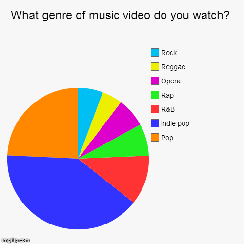
As the question which we asked has the highest percentage of music videos being watched were of the indie pop genre, we then decided to find out who chose this option to discover our specific target audience.
From looking at this questionnaire, we concluded that our main audience would be female. any further questions asked in this questionnaire were asked only to a female audience due to the fact that it is the largest proportion of people who chose indie pop genre were female. We then wanted to find out their age.
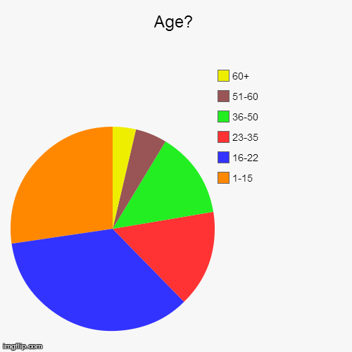
It is clear that our target audience is females between 16 and 22. The remaining questions were targeted at this age group and gender.
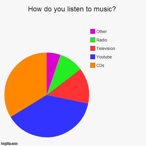
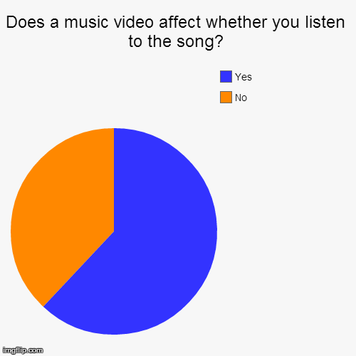
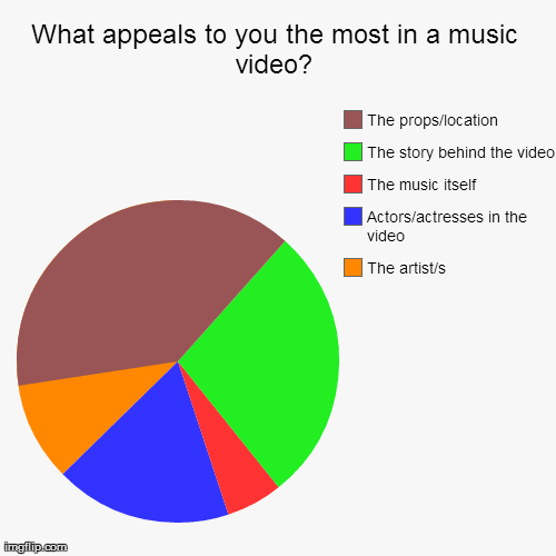
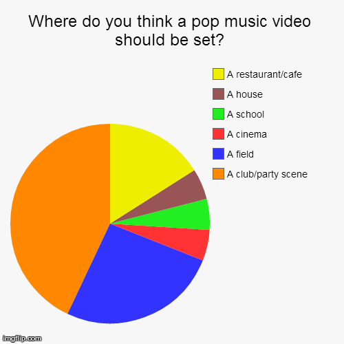
In conclusion, from this questionnaire we are able to find that it is mostly females at the age of 16-22 who watch the most music videos at around 1-5 times a day on average. These people expect to see romance in a music video as this is what they expect the story behind a pop song to be about. People also expect to see the location that the music video of a pop song is set to be either a restaurant/cafe, a field or a partying/club scene. We found that the props/location and the story behind the video are the two things that most appeal to people when it comes to a music video in the pop genre. Finally, we found that the music video DOES affect whether people listen to the song or not. Therefore when it comes to planning our music video we will have to make sure that we are thinking about who our target audience are and what it is that they expect to see in a music video from the pop genre.
Questionnaire 2 - GROUP WORK
From looking at the information to find out who our target audience is females from the age of 16 to 22. We then decided to create another questionnaire which gathered more information from our target audience about what they would want to see in an indie pop music video.
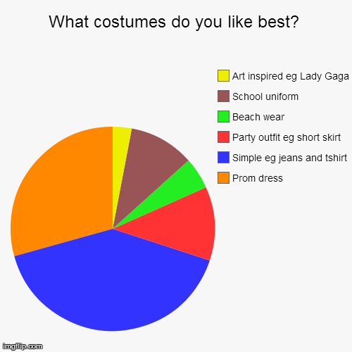
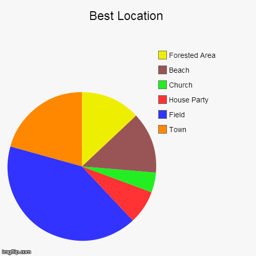
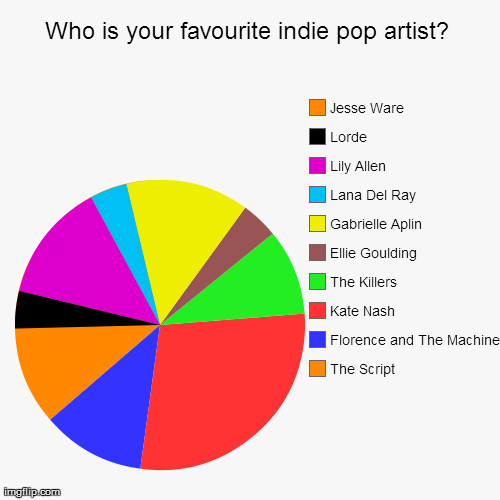
From our first questionnaire we have learnt that our target audience is mainly females between the ages of 16 and 22. With this information we have made another questionnaire targeting our audience. Our audience would like to see the music video filmed in a field, with the actor/actresses wearing simple clothing such as jeans and a tshirt. Most importantly our audience say their favourite indie pop artist is Kate Nash. Therefore we have decided to do Kate Nash's song - Foundations for our music video as we believe these conventions will be very accessible and realistic.
Influential music videos - GROUP WORK
What we enjoy:
- Realistic place eg) field
- Swooping motion
- Crane Shots
- Balloons eg) girly props
- Pastel Colours
- Simple glamorous appearance
- Vintage Style
- Heavy Make up
- Active/express body language
- Shy persona
- Mirrors
- Breaking 4th wall
- Twirling
- Dissolve
- She is the main focus
- Match on action
- Close ups to show beauty
- Camera movements
- Color draws music video together
What we disliked:
- Dance Routines
- Extravagant props
- Abstract scene with presents
- Shots from behind
- Little narrative
- Very little special effects/editing
What we enjoy:
- actions matching with beat (fingers drumming)
- use of a mirror (singing)
- way the camera follows her movement which highlights her importance in the video
- focus pull
- break of the 4th wall as she looks straight at camera
- change in lighting from dull to bright
- prop of smoke as it acts as a dissolve
- how the images are superimposed
- close up shots
- the way she stands out in 1:18 scene - glitter
- cut up shots
- tracking shots
- balloons
- shallow focus
- use of big lights
- graphic match
- the way the artist is still and everyone else is moving
- sped up superimposed images
- different colour effects added over the top
- how you see the artist playing the piano
What we didn't like:
- long takes - makes audience lose interest
- long shot - doesnt have much relevance
- how she fits in with the setting - makes her seem normal and doesnt allow her to stand out
- irellevant dancers and their outfits
- split screen where the artist is shown twice
- mirroring effect
- only 2 locations
What we like:
- Silhouette
- The way the artist's name is on the screen
- slow fade in to colour
- the tracking shot around the artist
- simple shots
- slow motion but the artist is still moving at same time of music
- slow zoom in that the audience don't notice
- breaking 4th wall by looking at camera
- change of lighting in background
- fade to a silhouette
What we didn't like:
- sting at the start of the video
- take is too long
- all very similar
- neutral colours
- feels slow and like it should come to a climax of some sort
- constant straight on angle
- change in lighting means the artist doesn't stand out anymore
- only 1 location - boring
- Same all the way through
- credits at end
What we liked:
- special effects sun shot
- effect over top to make it look vintage
- fade to silhouette
- colour change to shot
- shallow focus
- special effect of colours over top
- shot of artist falling off cliff - effective
- jump cuts
- close up of squeezing dress
- close up
- use of smoke
- spinning handheld camera
- flashback shots
- pan across as girl on bridge
- rapid and fast paced shots
- symbolism in it
- graphic match
- cross cutting
- smash of bottle goes with the beat of the music
- shot of artist standing and image going over the face
- low angles when she walks towards camera
What we didn't like:
- artist doesn't stand out
- all dark lighting
- quite boring - sameish shots
- same outfit all the way through
What we liked:
- shot of sea at the start
- digetic sound of sea
- shallow focus
- swooping camera movements
- dark lighting
- close ups of people's skin
- low angled shots
- tracking shot
- focus pull
- red lipstick of artist makes it effective
- slow motion
- smoke/fog
What we didn't like:
- haven't seen artist yet
- artist doesn't stand out compared to everyone else
- narrative isn't clear
- more narrative than the actual artist
- don't like dull lights all the way through
What we liked:
- shallow focus
- shot reverse shot
- digetic sound
- sound perspective increased volume
- simple location
- sow motion shot of the artist
- lighting on the artist
- simple clothes
- fog/smoke
- narrative story showing off their relationship
- kiss shot - handheld
- fairy lights
- focus pull
- live performance throughout narrative
- artist is looking straight at camera
- close up shot of the artist in simple location - field
- shallow focus
- long shot at the end
What we didn't like:
- dancing could be filmed in a better shot
- shot when the actress has to get in car with boyfriend is too long
What we liked:
- lots of little shots
- the way it is flashbacks
- vintage effect over the top
- shallow focus
- close up of hands
- close ups of face
- simple location - greenery
- look through a car window
- doesn't look directly at the camera
- natural environments
- loads of different locations
- live music - piano
- establishing shot
- natural environment - home cup of tea and cat
- bright lighting
- shots all show relationship between her and friend
- shown as pure
- sunset lighting
- all shots are happy and upbeat
- way she sings and shots move with the beat
What we didn't like:
- artist doesn't stand out
- can't really follow narrative easily due to loads of locations
- shots happen too quick
- not much narrative to create a full story
What we liked:
- digetic sounds
- setting the narrative at the start
- short takes are effective
- close up of woman clenching her fist
- slow motion
- long showing the environment
- close up shot
- candles in dark environment
- ariel shot
- slow motion of the couple kissing
- steamy scene is effective
- out of focus
- clear narrative
- fairy lights
- juxtaposed - happy scene next to sad scene
- close up slow motion of water over body
- water shots are very effective
- smoking is effective
- narrative is clear
- cross cutting to the band is good
What we didn't like:
- road sound at the start
- dont see the artist
- love performance as band
- woman's clothing
- too religion related
- scenes are too explicit at some points
- setting and outfits aren't realistic
What we liked:
- silhouette image of the artist
- hair has a glow
- sparkly outfit suits her and makes her stand out
- change of angle
- short takes
- bright lighting
- slow motion
- colour all matches - just hair that stands out
- out of focus shots are good
- change in location
- balloons
- heaven vibe
- zoom in to the artist and fade to black
What we didn't like:
- props are bad
- no narrative - just artist dancing
- no lyrics between video and lyrics
- party scene is abrupt and there is no build up to it
- artist doesn't stand out anymore
- no outfit change
- stars at end look tacky
What we liked:
- shadows
- tracking shot
- shots like with the beat
- close up shots
- shallow focus
- jump cuts are good
- tracking shot
- how the camera focuses on him and spins around him
- use of a full moon looks effective
What we didn't like:
- outfit is ordinary and he doesn't stand out
- always looking at the camera
- artist is acting as what the narrative is about
- live performance is unrealistic due to location
- artist looks dirty (not glamorous)
- location doesn't look real or realistic
- live performance goes on for too long
- new shot looks rubbish
- sped up shots look bad
- all very dull and not enough colour
- no change in location
- narrative has no resolution
What have you learnt and how can you use it?
From analysing these music videos of the indie pop genre we have decided we always want our artist to stand out whereas in some videos we watched the artist blended in with the narrative and their stardom was not emphasised. So in our music video we will make our artist centre stage and the focus of the viewers attention. From watching the videos we also like the use of fairy lights and candles as we believe it makes a very passionated and warm vibe to the video. We also like how throughout the narrative and live performance in Gabrielle Aplins music video the 4th wall is broken, we shall be doing this in our music video as we believe it allows emotions to be expressed. In Ellie Gouldings music video there are many close ups of body parts eg hand holding. We shall film this in our music video as we believe it helps show the relationship between the couples. In Lana Del Rays and The Killers music video we dislike the clothing used on the artist as it is unrealistic and doesn't make the artist stand out. In our music video we shall make the artist stand out by using clothing for example bright colours or contrast with the background.
From analysing these music videos of the indie pop genre we have decided we always want our artist to stand out whereas in some videos we watched the artist blended in with the narrative and their stardom was not emphasised. So in our music video we will make our artist centre stage and the focus of the viewers attention. From watching the videos we also like the use of fairy lights and candles as we believe it makes a very passionated and warm vibe to the video. We also like how throughout the narrative and live performance in Gabrielle Aplins music video the 4th wall is broken, we shall be doing this in our music video as we believe it allows emotions to be expressed. In Ellie Gouldings music video there are many close ups of body parts eg hand holding. We shall film this in our music video as we believe it helps show the relationship between the couples. In Lana Del Rays and The Killers music video we dislike the clothing used on the artist as it is unrealistic and doesn't make the artist stand out. In our music video we shall make the artist stand out by using clothing for example bright colours or contrast with the background.
Research your artist of your chosen song
Kate Nash - Foundations
Kate Nash - Foundations
- born 6th July 1987
- Best Female Artist 2008 BRIT Awards
- started career in 2005 by uploading music/videos to MySpace
- 2007 Made of Bricks was made and in 2009 released, this is the album foundations was on
- Reached number 1 in the UK top 20
- In 2011 released My Bestfriend Is You
- This album was number 16 in Europe and 6 in Germany
- Third album released 2013 called Girl Talk, 2 of the hits became in the top 100 on UK online downloads
- Biggest influence is Grunge band Hole
- Has 700,000 likes on Facebook
- Played in many festivals such as V Festival twice, Glastonbury
- Toured 4 times
Brand Image of Kate Nash
Colours - red, pink, oranges
Images - allow the audience to see her beauty. Not too posed, naturally taken with a simple back ground so her significance is highlighted.
Genre - indie pop
Mise en scene -
- very simple no drastic make up. In some cases dark eyes.
- hair not over done, quite a scruffy/simple "just woke up" look
- location will be very simple as it will highlight Kates importance
- props will not be too extravagant, for example balloons, umbrella etc may be used.
- lighting will be focused and bright to help highlight her significance and stardom
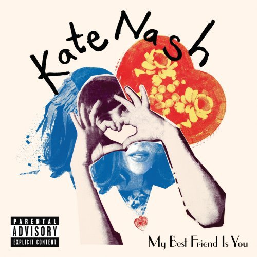
ALBUM COVER
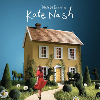
Kate Nash's brand image shows to be a bubbly and friendly image. She uses a lot of special effects and imagery that symbolises happiness, for example, the use of hearts in the album work that she has. The bright colours that she uses also have been used to stand out and make a point about something, as well as making her seem the centre of attention.
 We would prefer our brand image to be more like Ellie Goulding in the sense that she is more simplistic with her album covers and the way that she is portrayed. However, we will adapt some of Kate Nash's aspects to this, for example, we like the use of special effects that Kate Nash uses in many of her videos (bubbly writing and effects), as well as the idea of happiness and bubbly effects.
We are able to see from the picture that Ellie Goulding is clearly indie due to the way she has messy hair and alternative clothing that isn't mainstream. However, we are able to see how she is still glamorous by the use of makeup and jewellery that she wears. This shows how she has a twist and is a niche that is not like the norm of indie artists and makes her stand out compared to other in the genre. We would like to make our artist look in this way as we want to give the indie pop image off of making our artist seem alternative as well as still having the element of glamour about her.
Our brand image will contain bright and primary colours throughout as we want to give the artist relevance and give a positive view of the artist.
When creating our band image, we also will take into consideration other artists in the genre, for example, we like the idea of including colours throughout our album art work and through the videos, for which we get inspiration from Gabrielle Aplin's video and artwork for Please Don't Say You Love Me.
In other artwork by Gabrielle Aplin we found that a lot of the time, it was the props that were in colour, and the background was black and white for artwork as well as music videos. We believe that this will be a good special effect to include when creating our own music video and artwork, as well as noticing the idea of using simplistic props and making them stand out in order to symbolise things.
We would want the public to view our artist as a friendly and innocent character. We would want our artist to be promoted on radio channels such as Radio 1 and MTV in order to target an audience of people in late teenage years as well as giving the artist a less serious and chilled out vibe. Our artist would be shown on shows such as Jooles Holland as this programme would show off the new artist and show the way that she writer and performs her own music in a certain way.
ADVERTS
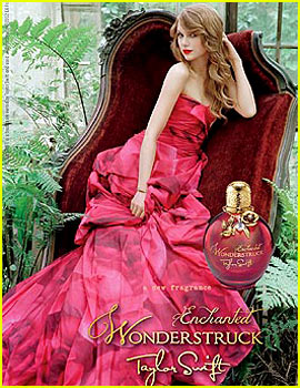 When creating adverts for our artist we want to make sure that they are shown as playful and innocent. We will include primary colours that are represented with the artist and will make it easier for them to be recognised. This will also help to show off the artist's genre.
We are shown that Taylor Swift is an indie artist by the way that she is sitting on a regal looking chair in a jungle, but we are shown how she is young by the bright colours and the mise-en-scene that she is wearing of being a large extravagant dress.
This is something that we will make sure to include when creating our own brand image for the artist as we want the indie pop genre to be shown as serious for the indie genre, but through the colours our artist will still have the pop element about them.
Team Meeting 2
In our second team meeting, we had decided on our song to be Foundations by Kate Nash. We printed the lyrics of the song and interpreted the lyrics in a way that we feel would be effective for our music video.
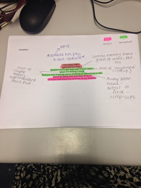
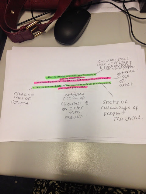
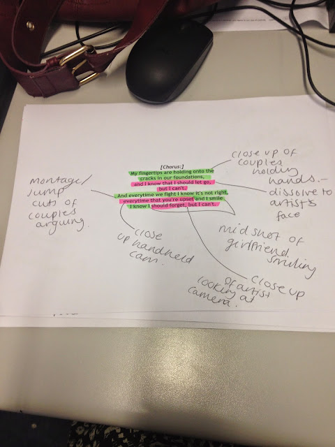
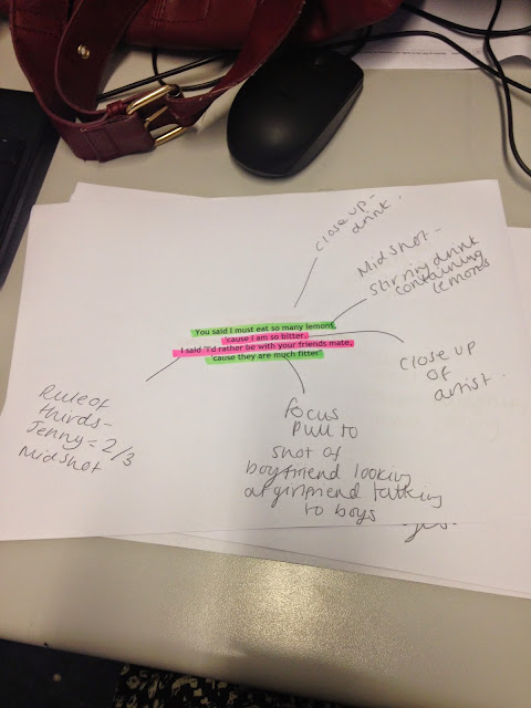
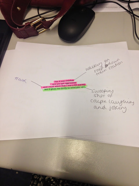
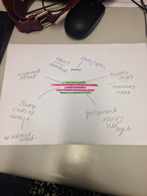
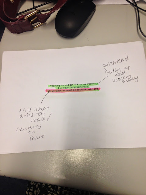
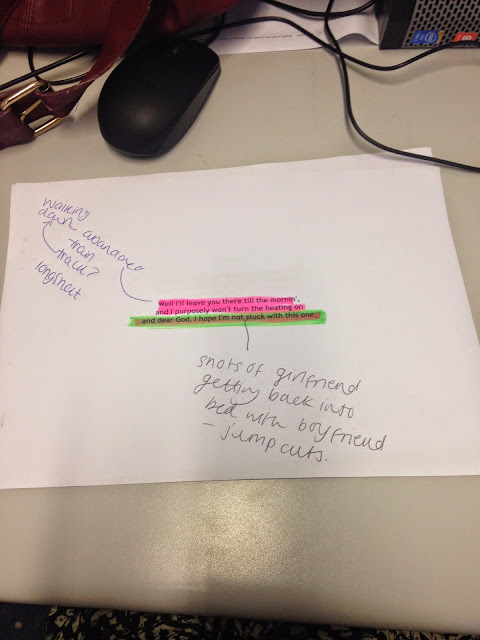
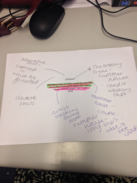
In conclusion to our analysis to lyrics we have shown lyric interpretation. For example in one of the verses the lyrics are "You said I must eat so many lemons, cause I am so bitter" to illustrate these lyrics we plan to film a mid shot of a girl stirring a drink with lots of cut up lemons in. This will help signify the meaning and amplify their importance in the song. We have also done this in the chorus when it says "my finger tips are holding onto" to illustrate these lyrics and amplify their importance we want to film a close up of a couples finger tips touching.
When we create moving images to a pre composed track the images and camera movements will mimic the music track and the beats to the song. For example the chorus is very fast faced so their will be plenty of shots and jump cuts to help keep the narrative interesting whilst signifying the artists talent.
In regards of filming and editing allows visual elements to be constructed such as zooms, cuts, colour/lighting, props etc. In our music video we shall use the primary colours as this is part of our brand image and will be used throughout so our audience will recognise the artist and a playful/friendly vibe shall be created. A variety of shots will be used for example from wide shots to extreme close ups so the audience can see the artist and narrative in different ways and the differences between the 2 can be highlighted.
Our genre (indie pop) shall be clear throughout our music video as we will be include conventions of that genre such as simpe props and location, a pop song which has a more serious tone, based around love, and a low budget.
Shooting performance will be shown in our music video for example we will include many beauty shots of the artist as we have planned to include many close ups and long shots so the audience can see the artist in full. Also the camera shots will be very varied so the audience can see the artist from all different aspects.
Mise-en-scene survey
We asked 50 people of our target audience which locations/props/costumes they preferred for an indie pop genre song.
Here were our options for location:
Team Meeting 2
In our second team meeting, we had decided on our song to be Foundations by Kate Nash. We printed the lyrics of the song and interpreted the lyrics in a way that we feel would be effective for our music video.


In conclusion to our analysis to lyrics we have shown lyric interpretation. For example in one of the verses the lyrics are "You said I must eat so many lemons, cause I am so bitter" to illustrate these lyrics we plan to film a mid shot of a girl stirring a drink with lots of cut up lemons in. This will help signify the meaning and amplify their importance in the song. We have also done this in the chorus when it says "my finger tips are holding onto" to illustrate these lyrics and amplify their importance we want to film a close up of a couples finger tips touching.
When we create moving images to a pre composed track the images and camera movements will mimic the music track and the beats to the song. For example the chorus is very fast faced so their will be plenty of shots and jump cuts to help keep the narrative interesting whilst signifying the artists talent.
In regards of filming and editing allows visual elements to be constructed such as zooms, cuts, colour/lighting, props etc. In our music video we shall use the primary colours as this is part of our brand image and will be used throughout so our audience will recognise the artist and a playful/friendly vibe shall be created. A variety of shots will be used for example from wide shots to extreme close ups so the audience can see the artist and narrative in different ways and the differences between the 2 can be highlighted.
Our genre (indie pop) shall be clear throughout our music video as we will be include conventions of that genre such as simpe props and location, a pop song which has a more serious tone, based around love, and a low budget.
Shooting performance will be shown in our music video for example we will include many beauty shots of the artist as we have planned to include many close ups and long shots so the audience can see the artist in full. Also the camera shots will be very varied so the audience can see the artist from all different aspects.
Mise-en-scene survey
We asked 50 people of our target audience which locations/props/costumes they preferred for an indie pop genre song.
Here were our options for location:
In conclusion, we found that our audience of 50 people would expect to find an indie pop music video to be set either in a field, a railway station, a party or a garden night scene. They did not expect to find an indie pop music video to be set in the location of a club, town or a school. We also found that our audience would expect a female indie pop artist to be wearing casual trendy clothing, ethereal clothing or a dress. Our audience would not expect to see a female indie pop artist wearing a suit, school uniform, leather, revealing clothing or abstract clothing. Finally, we found that our audience would expect to see the props of an umbrella, lanterns, bunting, fairy lights, balloons, candles and a guitar in an indie pop music video. However, they would not expect to see props of a mobile phone or a microphone as they found that this was too much like a pop genre music video. From the results which we have received, we shall adapt the results in which the audience like and want to see in our music video as this will encourage our target audience to watch our music video and will help us to potentially gain a wider audience.
Treatment - first draft
Intro
|
Verse 1
|
Verse 2
|
Verse 3
|
Chorus 1
|
Verse 4
|
Verse 5
|
Chorus 2
|
Bridge 1
|
Bridge 2
|
Bridge3
|
Chorus 3
|
Chorus repeated 4
|
Chorus 5(repeated)
|
Outro
|
|
Duration
|
00.00-0.10
|
0.11-0.29
|
0.30-0.41
|
0.42-0.51
|
0.52-1.18
|
1.19-1.30
|
1.31-1.40
|
1.41-2.04
|
2.05-2.17
|
2.18-2.26
|
2.27-2.38
|
2.39-3.01
|
3.02-3.12
|
3.13-3.25
|
3.26-3.58
|
Action
|
Before song starts party scene is
set
Someone hits play on cd player
Shots of props and people as well
as shots of artist
|
Shot of artist singing directly at
camera
Shots to boyf and girlfriend
Focus pull from artist to
narrative
|
Shallow focus of couple and close
up
Extreme close up of artist
Jump cut to artist
|
Extreme close up of artist
Jump cut to mouth
Jump cuts of girlfriend walking
away
|
Close ups of couples hand
Dissolve to artist
Montage of jump cuts of couple
arguing
Mid shot smile
|
Close up of stirring drink with
lemons
Walking down empty road—long shot
Close up of artist
Rule of thirds of artist
|
Tracking shot of artist
Close up of guitar
Swoop to Narrative playful arguing
|
Wide shots of artist with guitar
Close up of guitar
Special effects on couple to show
past
Slow motion to show happiness
|
High angle boyfriend asleep
Morning scene
Jump cuts of artist
Mirror shot
|
Girlfriend walks away
Mid shot of artist on fence
|
Tracking shots of artist
Couple get in bed
Match on actions
Jump cuts
|
Evening scene
Lots of cross cutting
Montage
Build up—boyfriend arrives at
girlfriend’s house
|
Silhouette of couple
Evening scene boy leading girl
outside to
Cross cut of artist looking at
summer house
Shot takes of summer house and
things inside
|
Wide shots showing couple outside
summer house
Shot of artist in field in evening
Close ups of couple showing how
they are back together (close ups of hands etc)
|
Shot takes that match with
music - close up shots of couple
Cross cutting to artist walking
away in a field—fade to black
|
Cast
|
Boyfriend and Girlfriend had an
argument
Artist by barbecue
Background cast tap
|
Boyfriend an Girlfriend
Friends
Artist
|
Boyfriend and Girlfriend
Friends
Artist
|
Boyfriend and Girlfriend
Friends
Artist
|
Boyfriend and girlfriend
Artist
|
Boyfriend and Girlfriend
Artist
|
Boyfriend and girlfriend
Artist
Background people
|
Boyfriend and girlfriend
Artist
|
Boyfriend and girlfriend
Artist
|
Boyfriend/girlfriend
Artist
|
Boyfriend girlfriend
Artist
|
Boyfriend/ Girlfriend
Artist
|
Boyfriend and girlfriend
Artist
|
Boyfriend and girlfriend
Artist
|
Boyfriend and girlfriend
Artist
|
Costume/props
|
Simple clothing
Summery
Casual trendy clothing
BBQ
CD player |
Simple clothing
Summery
Casual
Trendy clothing
Umbrella
|
Tables and chairs
Candles
Summery Clothing
Trendy/Casual
|
Tables and chairs
Candles
Summery Clothing
Trendy/Casual
|
Tables and chairs
Candles
Summery Clothing
Trendy/Casual
|
Drink
Guitar
Ethereal dress
Trendy casual
|
Guitar
Ethereal dress
Trendy/casual
|
Guitar
Flowers
Simple clothing eg summery dress
Red summer dress
|
Bed
Teddy
Guitar
Pjs
Jeans eg trendy
|
Gate
Bed
Teddy
guitar
|
Bed
Pj’s
Teddy
Guitar
Casual trendy clothes
|
Boy in suit
Artist in ethereal dress with guitar
Girl in casual but summery clothes
|
Boy in suit
Artist in ethereal clothing
Guitar
Girl in casual summer dress
Candles /fairy lights/lanterns/bunting |
Boy in suit
Artist in ethereal clothing
Guitar
Girl in casual summer dress
Candles /fairy lights/lanterns/bunting
|
Boy in suit
Artist in ethereal clothing
Candles/bunting/lanterns/fairy
lights
Girl in summer dress
|
Location
|
Barbecue
Garden Party
|
Barbecue
Garden party
|
BBQ
Garden party
|
BBQ
Garden party
|
BBQ
Garden party
|
Empty road
With distance from BBQ
|
Train station
Bridge of train station
|
Field
Gate
|
Empty road
Bedroom
|
Field
bedroom
|
Road /stream
Bedroom
|
Girl’s front door of house and
walking outside
|
Garden scene at night—path as boy
walks the girl up to the summer house
|
Garden scene while at summer house
Artist in field
|
Garden scene in summer house
Artist in field
|
Possible problems
|
Health and safety problems
Will we be able to have the places
available
|
Health and safety problems
Will we be able to have the places
available
|
Health and safety problems
Will we be able to have the places
available
|
Health and safety problems
Will we be able to have the places
available
|
Health and safety problems
Will we be able to have the places
available
|
Health and safety (in middle of
road)
|
At a train station
Risk of damaging equipment
|
Cars
Public
Cant find appropriate locations
|
Cars
Public
Cant find appropriate locations
|
Cars
Public
Cant find appropriate locations
|
Cars
Public
Cant find appropriate locations
|
Cant find appropriate location
Hazard of cars etc
|
Cant find appropriate location
|
Cant find location
Fire hazard from candles
|
Cant find appropriate location
Fire hazard from candles
|
Feedback from peers:
Jess - ' I think that the ideas are all good, but for the party scenes, I think wide shots would be more appropriate.'
Ellis - 'I think you should use different transitions between different scenes, for example, a range of shot types.'
Improved version of treatment
Intro
|
Verse 1
|
Verse 2
|
Verse 3
|
Chorus 1
|
Verse 4
|
Verse 5
|
Chorus 2
|
Bridge 1
|
Bridge 2
|
Bridge3
|
Chorus 3
|
Chorus repeated 4
|
Chorus 5(repeated)
|
Outro
|
|
Duration
|
00.00-0.10
|
0.11-0.29
|
0.30-0.41
|
0.42-0.51
|
0.52-1.18
|
1.19-1.30
|
1.31-1.40
|
1.41-2.04
|
2.05-2.17
|
2.18-2.26
|
2.27-2.38
|
2.39-3.01
|
3.02-3.12
|
3.13-3.25
|
3.26-3.58
|
Action
|
Before song starts party scene is
set – wide shot
Someone hits play on cd player – close up shot
Shots of props and people as well
as shots of artist – close ups and extreme close ups
|
Shot of artist singing directly at
camera – mid shot
Shots to boyf and girlfriend – mid
shot
Focus pull from artist to
narrative – close up to wide shot
|
Shallow focus of couple and close
up
Extreme close up of artist
Jump cut to artist – mid shot
|
Extreme close up of artist
Jump cut to mouth – extreme close
up
Jump cuts of girlfriend walking
away – long shot
|
Close ups of couples hand – close up
Dissolve to artist – mid shot
Montage of jump cuts of couple
arguing – mid shot
Close up of smile
|
Close up of stirring drink with
lemons
Walking down empty road—long shot
Close up of artist
Rule of thirds of artist
|
Tracking shot of artist close up
of feet
Close up of guitar
Swoop to Narrative playful arguing
– wide shot to see surroundings
Possible dissolve going on to next
scene
|
Wide shots of artist with guitar
Close up of guitar
Special effects on couple to show
past – wide shots
Slow motion to show happiness –
wide shots and long shots
|
High angle boyfriend asleep – mid shot
Morning scene
Jump cuts of artist – close up
shots
Mirror shot – close up with
dissolve and focus pull to mid shot
|
Girlfriend walks away – mid shot
Mid shot of artist on fence
|
Tracking shots of artist – close up
shots
Couple get in bed – mid shot
Match on actions – mid shots
Jump cuts
|
Evening scene
Lots of cross cutting
Montage – mid shot
Build up—boyfriend arrives at
girlfriend’s house – mid shots and close ups of smiles etc and flowers boy is
holding
|
Silhouette of couple - wide shot
Evening scene boy leading girl
outside to – wide shot
Cross cut of artist looking at
summer house – wide shot
Shot takes of summer house and
things inside – close up shots
|
Wide shots showing couple outside
summer house
Shot of artist in field in evening
– wide shot
Close ups of couple showing how
they are back together (close ups of hands etc)
|
Shot takes that match with
music - close up shots of couple
Cross cutting to artist walking
away in a field—fade to black – long shot
|
Cast
|
Boyfriend and Girlfriend had an
argument
Artist by barbecue
Background cast tap
|
Boyfriend an Girlfriend
Friends
Artist
|
Boyfriend and Girlfriend
Friends
Artist
|
Boyfriend and Girlfriend
Friends
Artist
|
Boyfriend and girlfriend
Artist
|
Boyfriend and Girlfriend
Artist
|
Boyfriend and girlfriend
Artist
Background people
|
Boyfriend and girlfriend
Artist
|
Boyfriend and girlfriend
Artist
|
Boyfriend/girlfriend
Artist
|
Boyfriend girlfriend
Artist
|
Boyfriend/ Girlfriend
Artist
|
Boyfriend and girlfriend
Artist
|
Boyfriend and girlfriend
Artist
|
Boyfriend and girlfriend
Artist
|
Costume/props
|
Simple clothing
Summery
Casual trendy clothing
BBQ
CD player |
Simple clothing
Summery
Casual
Trendy clothing
Umbrella
|
Tables and chairs
Candles
Summery Clothing
Trendy/Casual
|
Tables and chairs
Candles
Summery Clothing
Trendy/Casual
|
Tables and chairs
Candles
Summery Clothing
Trendy/Casual
|
Drink
Guitar
Ethereal dress
Trendy casual
|
Guitar
Ethereal dress
Trendy/casual
|
Guitar
Flowers
Simple clothing eg summery dress
Red summer dress
|
Bed
Teddy
Guitar
Pjs
Jeans eg trendy
|
Gate
Bed
Teddy
guitar
|
Bed
Pj’s
Teddy
Guitar
Casual trendy clothes
|
Boy in suit
Artist in ethereal dress with guitar
Girl in casual but summery clothes
|
Boy in suit
Artist in ethereal clothing
Guitar
Girl in casual summer dress
Candles /fairy lights/lanterns/bunting |
Boy in suit
Artist in ethereal clothing
Guitar
Girl in casual summer dress
Candles /fairy
lights/lanterns/bunting
|
Boy in suit
Artist in ethereal clothing
Candles/bunting/lanterns/fairy
lights
Girl in summer dress
|
Location
|
Barbecue
Garden Party
|
Barbecue
Garden party
|
BBQ
Garden party
|
BBQ
Garden party
|
BBQ
Garden party
|
Empty road
With distance from BBQ
|
Train station
Bridge of train station
|
Field
Gate
|
Empty road
Bedroom
|
Field
bedroom
|
Road /stream
Bedroom
|
Girl’s front door of house and
walking outside
|
Garden scene at night—path as boy
walks the girl up to the summer house
|
Garden scene while at summer house
Artist in field
|
Garden scene in summer house
Artist in field
|
Possible problems
|
Health and safety problems
Will we be able to have the places
available
|
Health and safety problems
Will we be able to have the places
available
|
Health and safety problems
Will we be able to have the places
available
|
Health and safety problems
Will we be able to have the places
available
|
Health and safety problems
Will we be able to have the places
available
|
Health and safety (in middle of
road)
|
At a train station
Risk of damaging equipment
|
Cars
Public
Cant find appropriate locations
|
Cars
Public
Cant find appropriate locations
|
Cars
Public
Cant find appropriate locations
|
Cars
Public
Cant find appropriate locations
|
Cant find appropriate location
Hazard of cars etc
|
Cant find appropriate location
|
Cant find location
Fire hazard from candles
|
Cant find appropriate location
Fire hazard from candles
|
First draft of pitch.


FIRST PITCH VIDEO
We pitched our idea for our music video to our target audience so that we were able to gain feedback.
Feedback from focus group

Jess - 'I think you need to be really specific with your camera movements. However, I like the choice of song and think it has lots of potential.'
Samantha - 'I think you understand the genre really well, but I think you need to think about the costume as it needs to look stylized rather than naturalistic.'
conclusion from feedback:
We have now concluded that our target audience enjoyed the choice of song, believed that our genre was clear and thought the locations were appropriate. However they wanted to gain more knowledge about editing and the key elements which will be included in our music video. Our target audience also wanted to see more consideration to our camera movements so in the pitch amendments we shall include this. Costume props and colour shall also have more information in our new pitch to give our audience extra knowledge on what we shall be including in our video. From the feedback from our target audience we shall continue to use the same locations however in our new pitch we shall give more consideration to the costume which will be fashionable yet casual.
New Pitch
Fourth Team Meeting
Risk Assessment
Prop and location list
Shot list
story board first draft


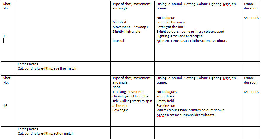


Changes.
After having feedback and a team discussion we decided to change this story board as the timing did not fit correctly in all shots and the music video we were making was very similar to the official Kate Nash - Foundations music video. Therefore we decided to plan a new one out and include timings and lyrics to make the story board more precise and change some scenes.
Plan for new story board
.JPG)

New Story Board


Permission Letter

.JPG)




No comments:
Post a Comment